We acknowledge the Traditional Owners of the land on which the Queensland Art Gallery | Gallery of Modern Art stands and recognise the creative contribution First Australians make to the art and culture of this country.
Peter Upward / Australia 1932–1984 / Painting no. 3 1970–71 / Synthetic polymer paint on canvas / 183 x 122cm / Purchased 1998. Queensland Art Gallery Foundation Grant / © The artist
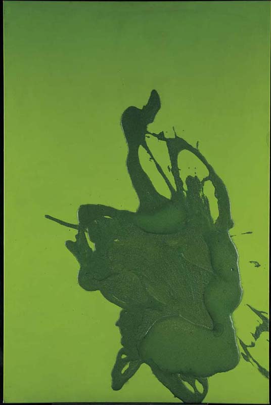
Peter UpwardPainting no. 3 1970–1971
Not Currently on Display
Peter Upward’s earliest abstract paintings in the early 1960s are characterised by their monochromatic purity and calligraphic intensity. By the late 1960s and early 1970s — the period of Painting no. 3 — Upward had modified his approach, using brilliant and almost psychedelic colours drawn from the fashion and mass media of the time. Significantly, the great majority of the works in this series were also monochromatic, with tones of the same colour often used for the ground and the great swelling gestural marks that seem to explode onto the canvas.
Upward was clearly moving with the times, alert to the new cheeky mood of popular cultural influence in Australian art of the early 1970s. In a sense, this makes the work more distinctly vernacular, pointing to the widespread naturalisation of international modes in Australia at the time.
As with all the works in this series, Upward later reframed Painting no. 3 in brightly coloured tubular plastic frames that he designed: the frame for this work was hot pink. Subsequent owners of the works have largely chosen to remove the frames, and the hot pink frame has not survived.
Peter Upward is regarded as one of Australia’s most important Abstract Expressionist painters. Like many Australian artists of the mid twentieth century, he travelled to Italy, France, Spain and the United States to continue his studies of modern art. He returned to Australia to settle in Sydney around 1958, where he participated in the development of the new Abstract art.
Upward’s first black-and-white gestural paintings combined the influences of Action painting with Japanese calligraphic spontaneity. During his American travels he was also influenced by Franz Kline and Robert Motherwell’s celebration of the creative act of painting, where the gestural mark was considered more important than allusions to the world outside the painting. From the early 1970s, Upward introduced colour, first using clashing psychedelics — popular in the late 1960s — and then more muted colours, which emphasise the works’ vigour.